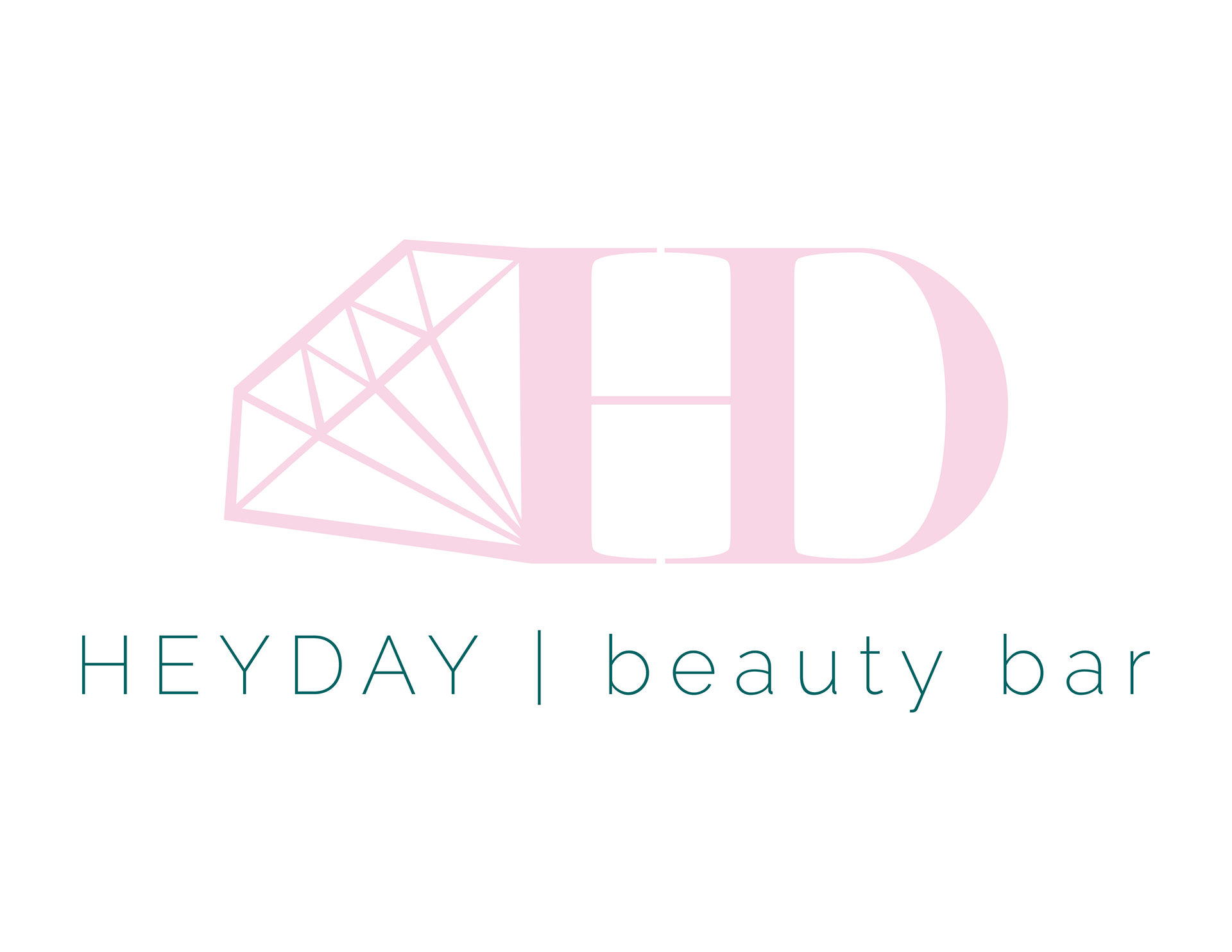
Because Heyday is a new company, this logo is part of their initial branding, so it was crucial to make it perfect so they can appropriately convey their brand for their launch. The main focus of the salon is to make luxury services simple and affordable for the average woman. I knew I wanted to somehow incorporate a diamond into the design because they symbolize luxury, as well as brides, which is their specialty. However, I also wanted to keep the logo very basic and clean to portray that simplicity. I was inspired by luxury brands like Louis Vuitton and Chanel and started with the initials HD in a thin serif font to reflect that sense of luxe and refinement. I joined them together into one shape and then got the idea to include the diamond on the other side to add a little extra visual interest without being too overwhelming. I added the full name beneath in a thin sans serif font to add contrast and visual interest.
Because the logo is simple and can be easily scaled, it will translate well to all types of media from web to print. It is different enough from other luxury logos while still keeping that refined feel, which makes it stand out and become memorable. The client requested the colors deep teal & pale pink, which I feel works well for this logo. Because the pink is a very light color and would only work well on bigger, thicker components, I decided to use it for the main logo and the deep teal color for the wording below. The two colors feel very luxurious and help contribute to the contrast between the logo image and text. Overall, the logo flows very well and has the simple, luxurious feel we were going for.
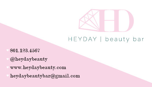
This is the front of the business card I created for Heyday Beauty Bar. I added the pink diagonal background to add interest and dimension to the card. I struggled with many different placements of the background, but finally decided to balance out the heavy pink background on one side by putting the logo up in the corner. I brought the diamond element into the card by using little diamonds as the bullet points for the all the information, which brings repetition the the design and helps tie the logo in to the rest of the card. I was using the same sans serif font as the logo text for the card information, but during my peer review, we decided that the numbers looked too "bouncy" and playful for such a sleek, clean design so I decided to change it to the serif font and I am very pleased with how it turned out.
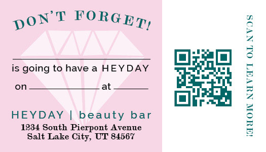
This is the back of the business card that can also double as a client appointment reminder card. I decided to use the pink background again for repetition and cohesiveness, but this time used it as a seperator of sorts between the appointment reminder content and the QR code. I think it balances out the card. I also added a slightly transparent diamond behind the appointment reminder. It adds a fun element to the back of the card and also helps tie it in to the front. I chose to put the address on the back of the card rather than the front so it would be right by the appointment reminder.
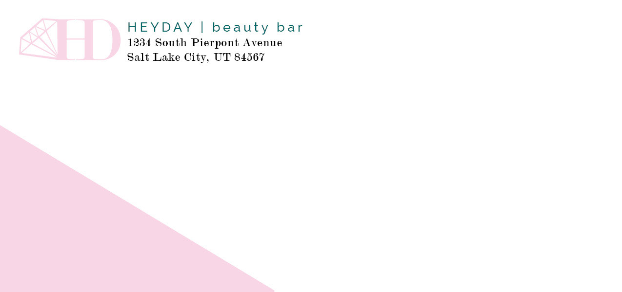
This is the envelope I created for my client. I repeated the same pink diagonal background element from the business card, but kept it only at the bottom left of the envelope so it won't interfere with addressing, stamping or post office bar codes. When the envelope is addressed, the pink background element will help balance the envelope. This helps the envelope to look purposeful and as part of a complete set, which shows a sense of professionalism right from the start. For the return address, I seperated the logo and just used the graphic element and typed out the name of the business so it would work better as an address.
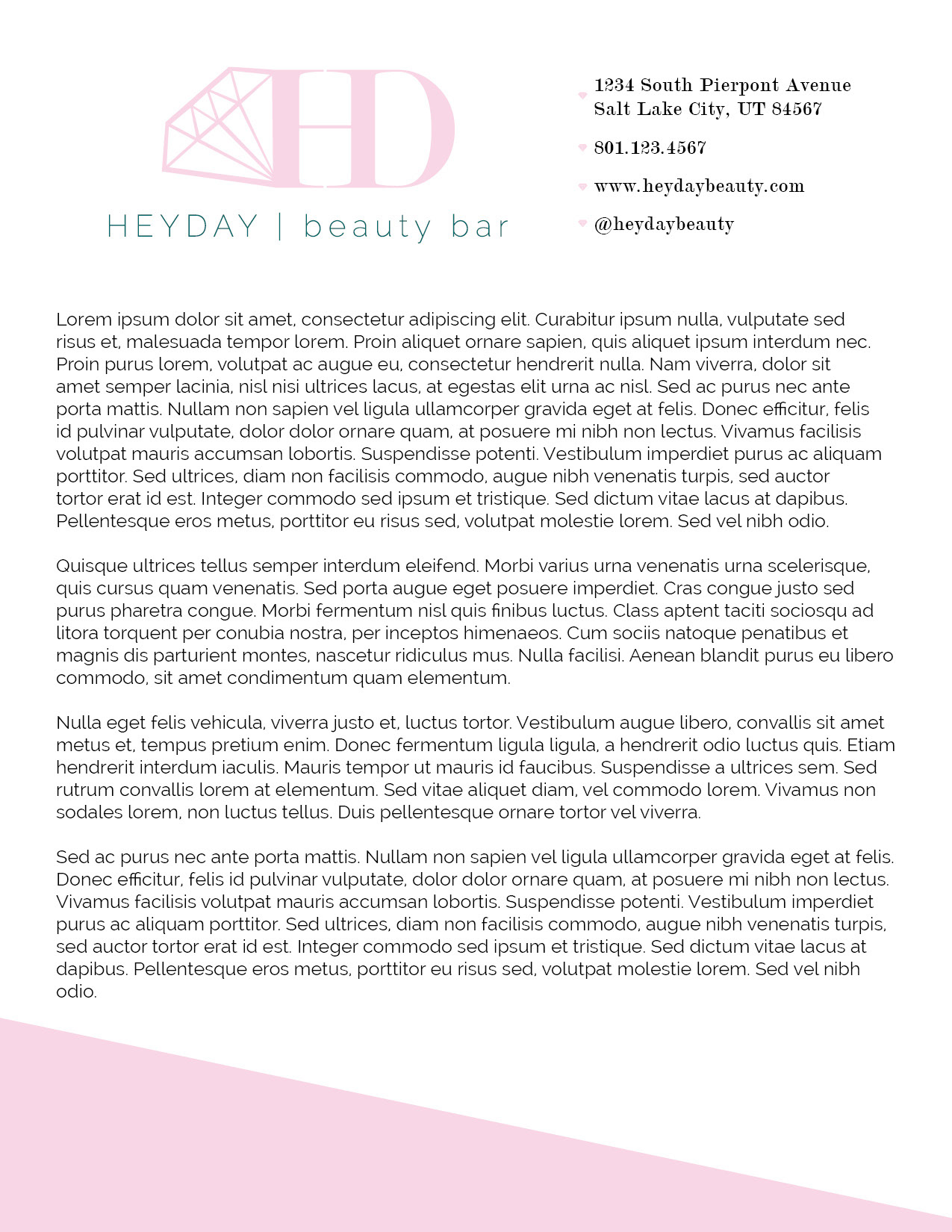
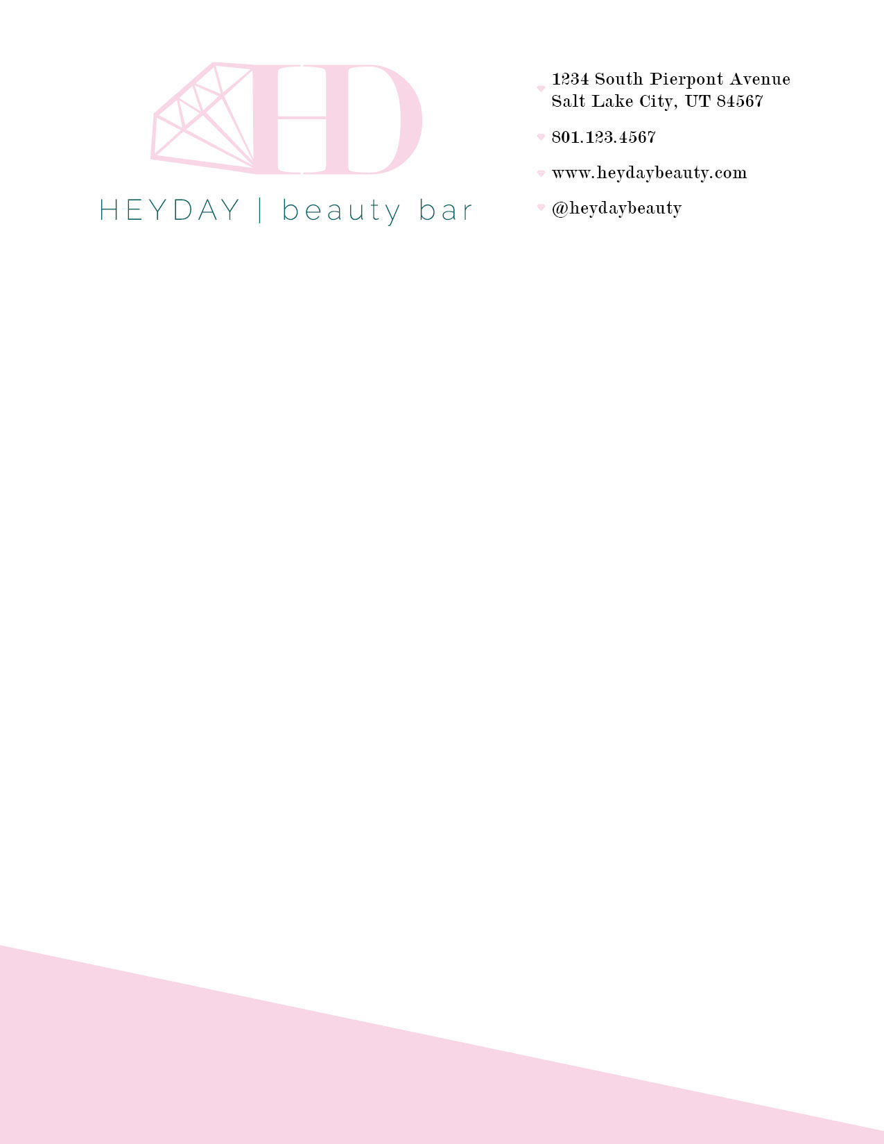
This is the letterhead for HEYDAY. Again, I continued the use of the pink diagonal background element, keeping it at the very bottom of the page so it doesn't distract from any text. I also repeated the diamonds as bullet points from the business card. It just gives the design something extra that is fun and unexpected. I decided to use a lot of white space to give it that "fresh" feel and separated the page into thirds. The first 2/3 of the top of the page has the logo and the last 1/3 has all the company contact information. Below that is the body text followed by the pink graphic element. The end result is a very balanced, clean feel that portrays the luxury feeling that my client is going for. You can see a copy of the letterhead without any sample body text below.
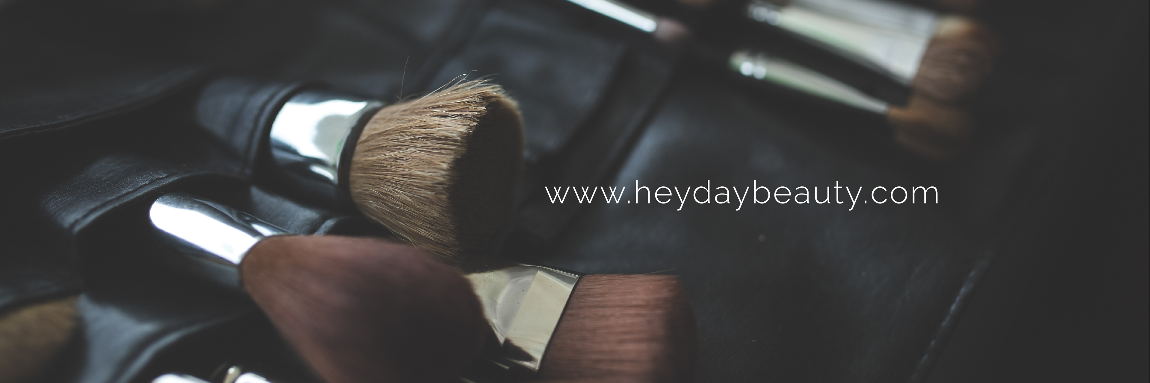
For the cover photo for social media, I chose this image For the header image, I selected this image because it is black and sleek, communicating both the "Why" and luxury feel of the company and their literal purpose--beauty. I added an overlay with their web address as well so clients can easily see where to go to learn more or book an appointment. I placed the website where I did so it will show up on both computers and mobile screens.
This digital collateral will be displayed on social media such as Twitter and Facebook. i chose to just use the graphic element of the logo without the company name because it will be relatively small, making it hard to read on some screens and their name will always accompany this image on social media so it wasn't really necessary. The profile picture will be the most commonly seen part of their page, so I also decided to use this element because it is the most recognizable part of the brand.
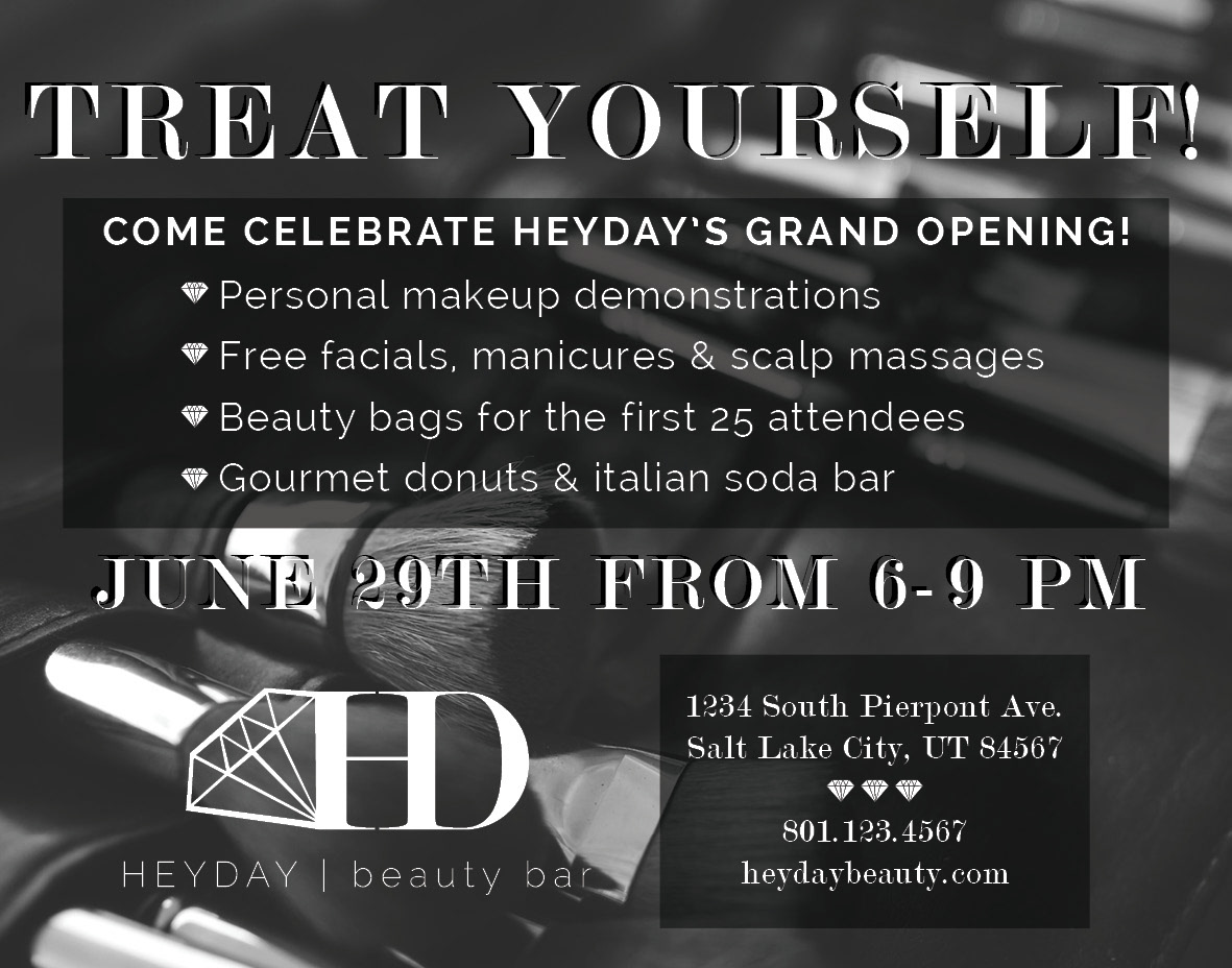
This is a black & white magazine ad advertising HEYDAY's grand opening event. I really struggled to find an image that looked good in black and white and would work to have text over the top and stay readable. I tried a variety of options but finally settled on this image of makeup brushes. Not only is it a relatively dark picture so that all the white text really pops against it, but the simple luxury feel of the image helps communicate the "why" of the company and will give customers the idea of being pampered with makeup just by looking at it.I also kept the amount of text to a minimum to not overcrowd the ad, especially since the background is an image. I made "Treat Yourself" large at the top because that is the name of the event and it will be sure to catch people's attention.I layered white text on top of a black shadow text to make sure it really contrasted against the lighter parts of the background image and was easy to read. I then followed that with the some fun little snippets of what will be going on at the event to keep people interested with a bulleted diamond list that mimics the diamond theme we have seen throughout the branding package. The black background provides contrast to the rest of the ad and draws attention to that section, which is the most important because it is the fun stuff that will actually entice people to come to the event. I then added the date and time, followd by the logo, name, address & contact information in case anyone has questions about the event. Although it is definitely a challenge to provide contrast and interest with a black and white ad, I was able to make it easy to read and interesting by mixing a serif with a sans serif and taking advantage of the black backgrounds.
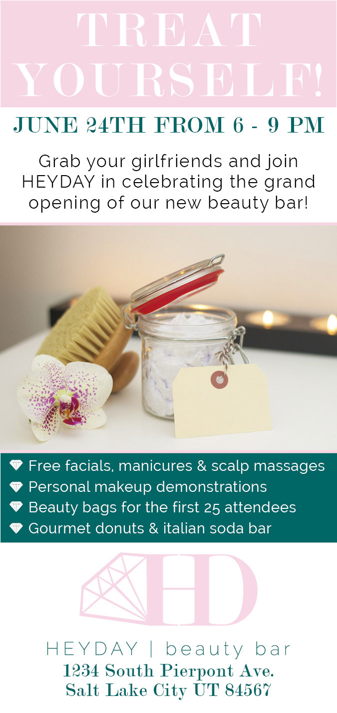
This is a full-color magazine ad for HEYDAY's grand opening celebration. I originally planned to use an image for the entire background, but finding one that fit the "why" of the company and event that would also fit the ad and look good with text over it was a challenge, so I ultimately ended with this layout, with an image in the center with the text in various colorblocked sections around it. Just as with the black & white ad, I gave "treat yourself" the highest hierarchy to draw people in. I followed it with the date in the same serif font for contrast and attention, followed by a brief description of the event in sans serif. The spa picture gives a feeling of luxury and pampering so just by glancing at the ad, people will be able to understand what the event is all about. Below the image, I used an emerald background to draw the eye to the little details about the event, as this is the most important part.Beneath that is the logo and address of the event. For this entire ad, I kept with the pink & emerald theme to keep their branding consistent and recognizable. The emerald contrasts well with the pale pink and white and helps bring a nice hierarchy and visual interest to this tall ad.